Color Theory & Social Media Icons
- Teach the basics of color theory: primary, secondary, complementary colors
- Explore mood, meaning, and harmony in design
- Practice using Illustrator to design simple, colorful social media icons
- Build visual storytelling skills through shape + color
Scripture
Matthew 5:14 (HCSB) – “You are the light of the world. A city situated on a hill cannot be hidden.”
- How can color be used to communicate light, joy, or truth in a design?
- What colors do you personally connect with?
Course Content
Color Theory
- Primary colors: Red, Blue, Yellow
- Secondary colors: Orange, Green, Purple
- Tertiary colors: Mixing primaries & secondaries
- Color meanings (example: red = passion, blue = trust, yellow = joy)
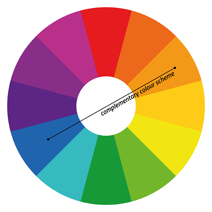
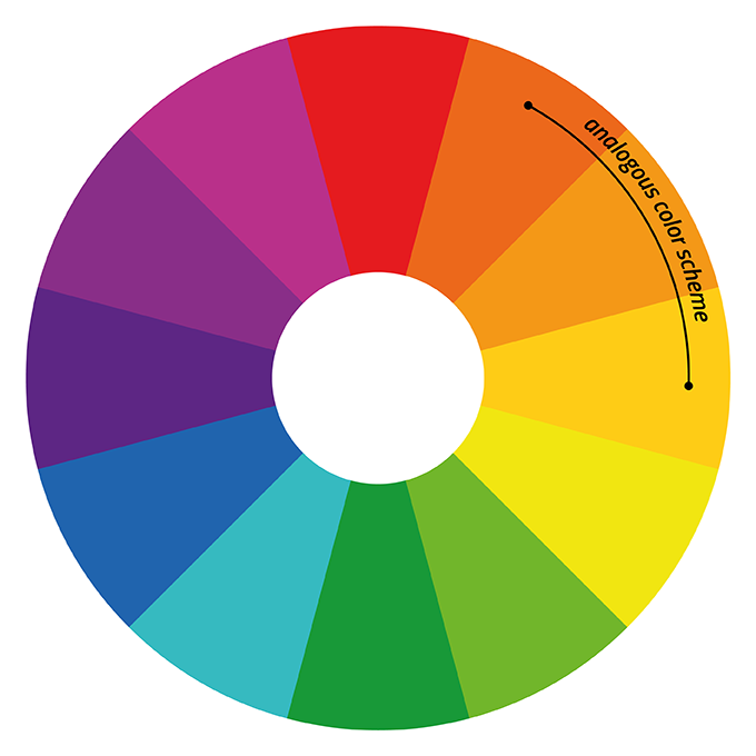
- Complementary vs. Analogous /əˈnaləɡəs/ color schemes
Illustrator – Icon Design
Open Illustrator:
- Set artboard to 600x600px square
- Use the Ellipse Tool, Rounded Rectangle Tool, and Pen Tool to create 3–5 basic social media icons (Instagram, YouTube, X, Facebook, etc.)
- Use Fill and Stroke to experiment with color schemes
- Encourage:
- 1 icon in complementary colors
- 1 icon in analogous colors
- 1 icon in brand-inspired colors
These skills will help them design ads, logos, and branding later.
Students design 3–5 social media icons using what they’ve learned:
- Each icon should be visually consistent
- Use different color schemes to explore mood
Keep it simple and recognizable
Homework
Due Next Class:
-
- Export your icon set as JPG and PNG
- Upload to Google Classroom or shared folder
- Answer the question:
- “Which color schemes do you personally like designing with and why?”
- Submit in Google Doc