Business Card Design – Branding in Print
- Learn the purpose and structure of a business card
- Use Adobe Illustrator to create a professional card for your made-up company
- Reinforce design principles like alignment, spacing, color balance, and readability
Build a cohesive brand identity system
Scripture
Proverbs 22:1 (HCSB) – “A good name is to be chosen over great wealth; favor is better than silver and gold.”
- What does your name or brand represent to others?
- Why is it important to present yourself well with clarity and intention?
Course Content
Review
Purpose
-
A contact tool used to share key information quickly.
-
Serves as the first impression of a brand or professional identity.
-
Reflects your style, professionalism, and attention to detail.
Standard Size
-
U.S. Standard: 3.5 x 2 inches
-
This size fits easily in wallets, card holders, and pockets.
-
International sizes may vary slightly.
Key Information to Include
-
Name & Role/Title
-
Example: Danielle Smallwood – Graphic Designer & Photographer
-
-
Business Name/Logo
-
Ensure the logo is clear and visually balanced.
-
-
Contact Information
-
Phone number
-
Email address
-
Website
-
Social media handles (optional but modern)
-
-
Optional:
-
Slogan or Tagline that summarizes your mission or brand tone
Example: “Bringing Ideas to Life Through Design & Photography”
-
Design Tips
-
Keep the layout simple, clean, and readable.
-
Use high contrast between text and background.
-
Maintain consistent branding (colors, fonts, logo style).
-
Include white space for a professional and uncluttered look.
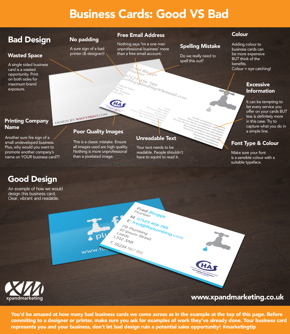
Examples
✅ Good Example
-
Clean design with balanced spacing
-
Legible text and professional font
-
Strong contrast between background and text
-
Key details easy to find at a glance
❌ Bad Example
-
Overcrowded with too much text or imagery
-
Poor contrast (e.g., light text on light background)
-
Multiple font styles that clash
-
No clear hierarchy or focus
Illustrator Demo – Design a Business Card
- Open new document at 3.5” x 2” with 300 dpi resolution
- Set up safe margin guides
- Insert logo from Week 10
- Add placeholder text for contact info
- Use alignment tools and type hierarchy for clarity
- Use brand colors and fonts consistently
🛠 Optional: Create front + back designs
Design Time – Student Business Cards
Students design a card for their made-up company.
Requirements:
- Include name, title, company logo, contact info
- Use brand colors, fonts, and consistent spacing
- Pay attention to alignment and spacing
- Export as JPG and PDF when finished
Less is more! Keep it clean and professional.
Homework
- Submit JPG and PDF of business card
- Submit Illustrator file
- Write a few sentences:
- “What does your business card say about you?”
“What design decision helped your card look professional?”