Kahoot Review + Mini Logo Sketch Activity
- Review key concepts from Weeks 1–8 through a fun and interactive Kahoot quiz
- Introduce the concept of logos and branding
- Let students start sketching logo ideas for their future made-up company project
Kahoot.it
Scripture
Colossians 3:23 (HCSB) – “Whatever you do, do it enthusiastically, as something done for the Lord and not for men.”
➡️ Discussion Prompt:
- Why is it important to give your best—even in creative work?
- How can your designs reflect your values or faith?
Course Content
What Makes a Good Logo?
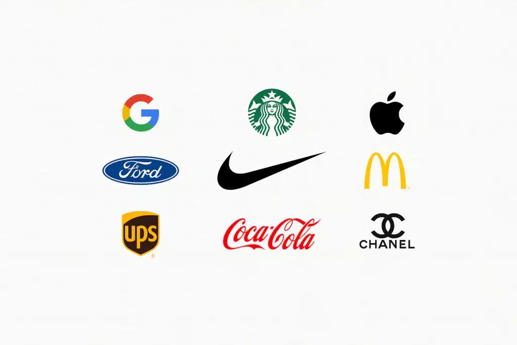
- Simple (Nike, Apple, Target)
- Memorable
- Versatile (works in black & white, small & large)
- Relevant to the brand

Symbol vs. Wordmark
A symbol (also called a logo mark) is an image or icon that represents a brand without using words.
-
Examples: Apple’s apple, Nike’s swoosh, Twitter’s bird.
-
A symbol works best when a brand is well known, or when the image itself clearly expresses the company’s identity.
A wordmark is a text-based logo that focuses on the company’s name written in a unique typeface.
-
Examples: Google, Coca-Cola, Disney.
-
Wordmarks are ideal for new or smaller brands that want their name to be memorable and clearly recognized.
Iconic vs. Abstract Logos
An iconic logo is based on a recognizable image—something real and easy to identify.
-
Example: The Target bullseye or Apple’s bitten apple.
-
These logos are simple and memorable, helping people instantly connect the image to the brand.
An abstract logo uses geometric shapes or creative forms that don’t directly represent real objects.
-
Example: The Adidas stripes or Pepsi’s circular swirl.
-
Abstract logos are great for expressing emotions, movement, or big ideas without being too literal.
Color Choices in Logos
Color plays a powerful role in what a logo feels like. Each color creates a mood and helps shape how people see the brand:
| Color | Meaning/Emotion | Example Brands |
|---|---|---|
| Red | Energy, passion, excitement | Coca-Cola, YouTube |
| Blue | Trust, calm, professionalism | Facebook, Dell |
| Yellow | Optimism, warmth, friendliness | McDonald’s, Snapchat |
| Green | Growth, health, balance | Starbucks, Whole Foods |
| Purple | Creativity, luxury, imagination | Cadbury, Hallmark |
| Black/White | Power, simplicity, elegance | Nike, Chanel |
Designers carefully choose colors that match the brand’s message and audience.
A great logo uses color not just to stand out—but to make people feel something that fits the company’s story.
Sketch Time – Brainstorm Your Brand
Students begin sketching 3–5 logo ideas on paper
“Logo Brainstorming Sheet”
- Name of made-up company
- What their company does
- 2–3 colors you might want to use
- Simple icon or wordmark ideas
Optional prompt: “What symbol represents your values?”
Homework
- Choose your favorite logo sketch
- Come up with a made-up company name if you haven’t already
- Upload a picture of your sketch or scan it
Write 2–3 sentences explaining the meaning behind your logo idea
